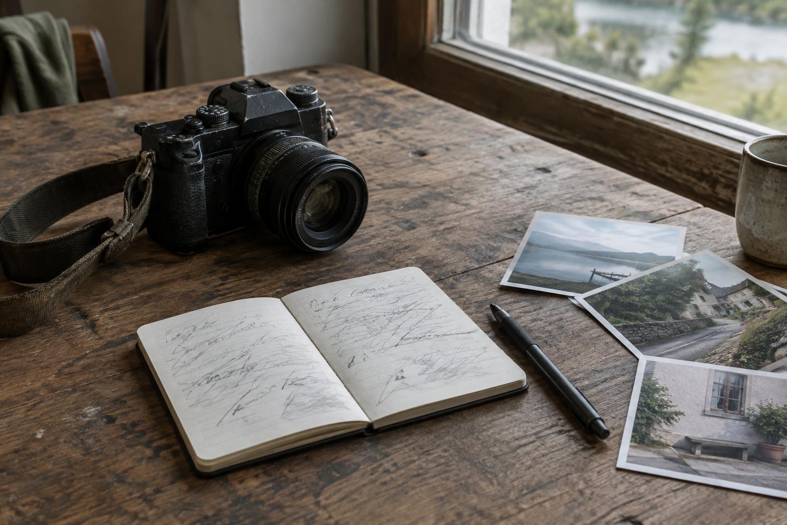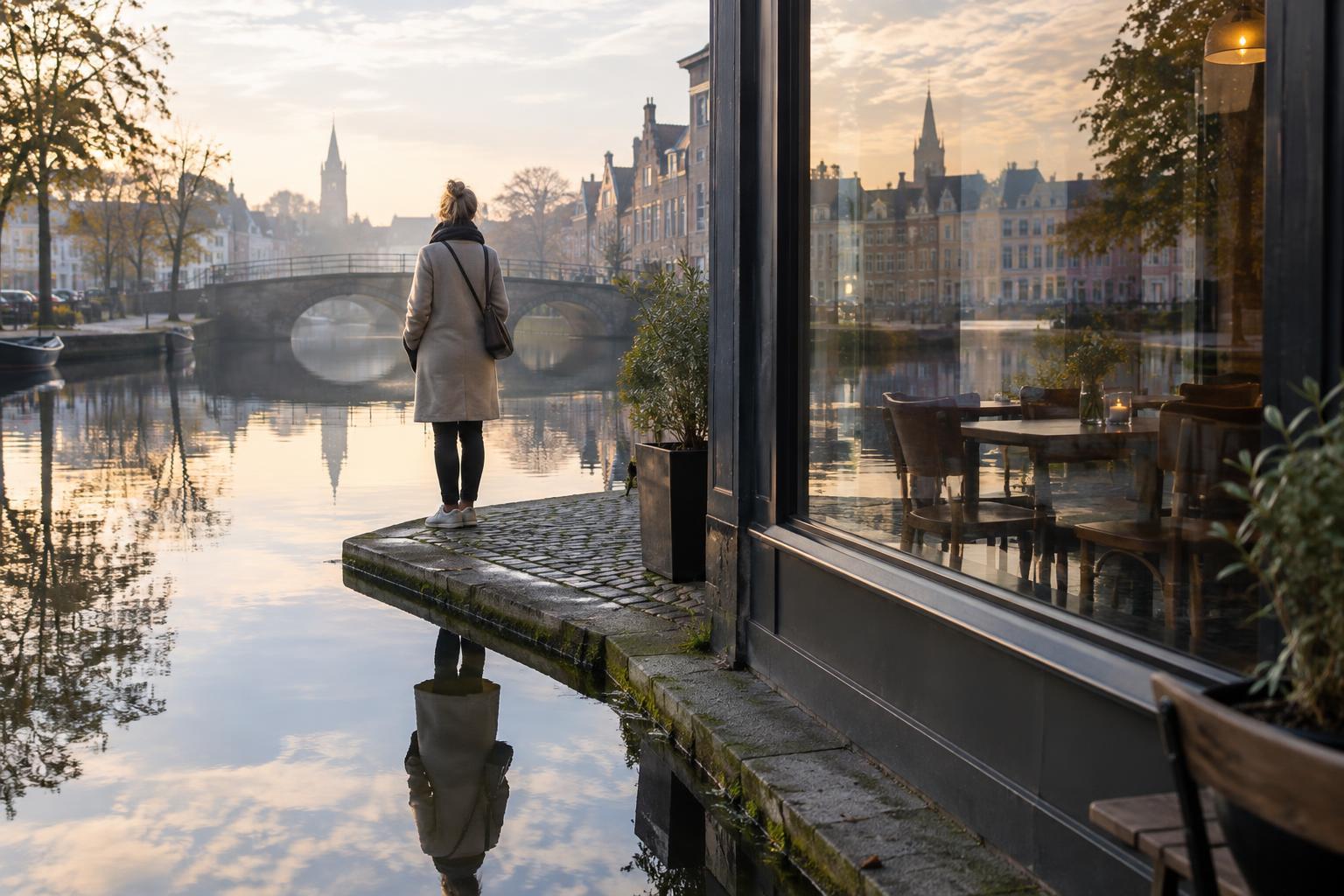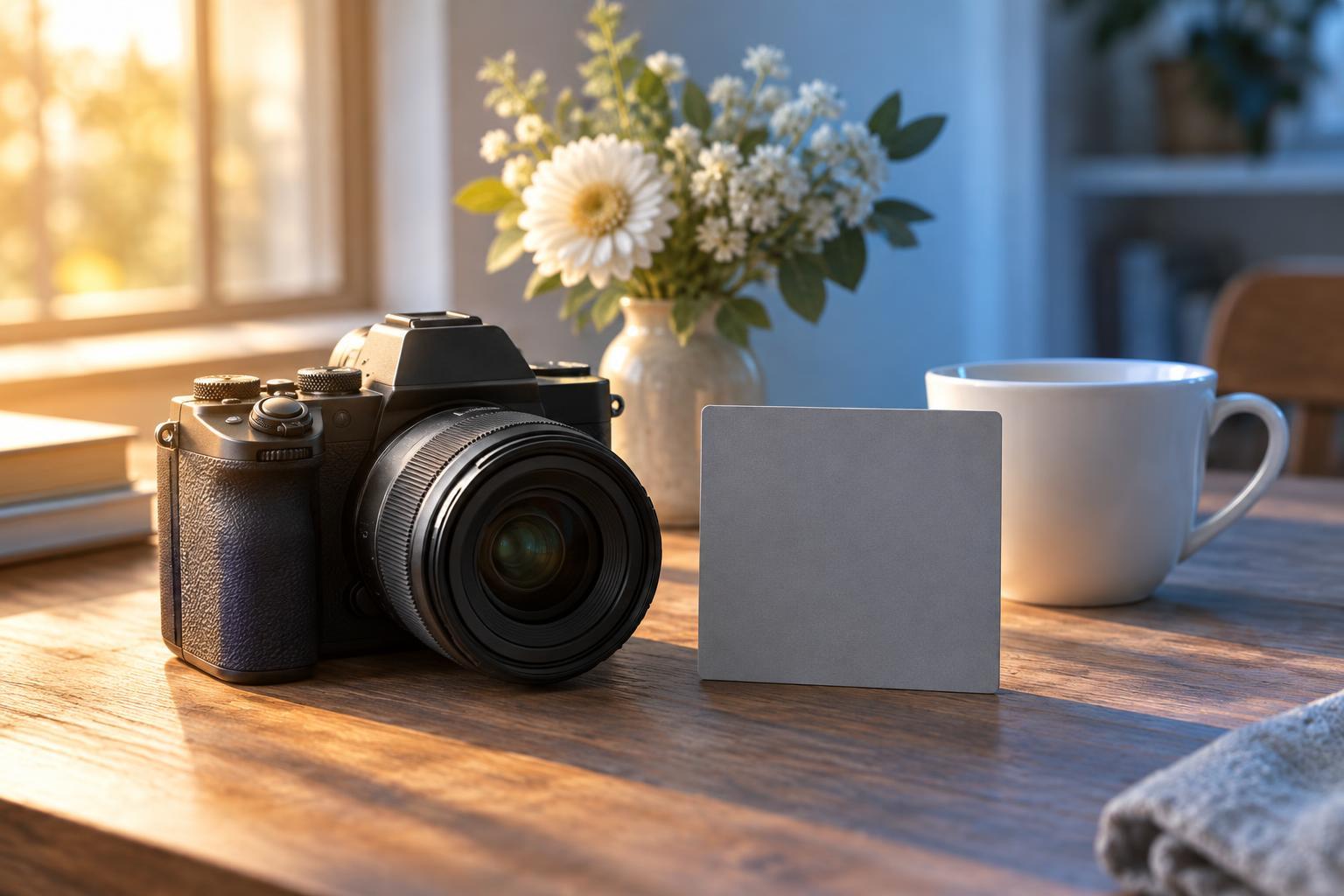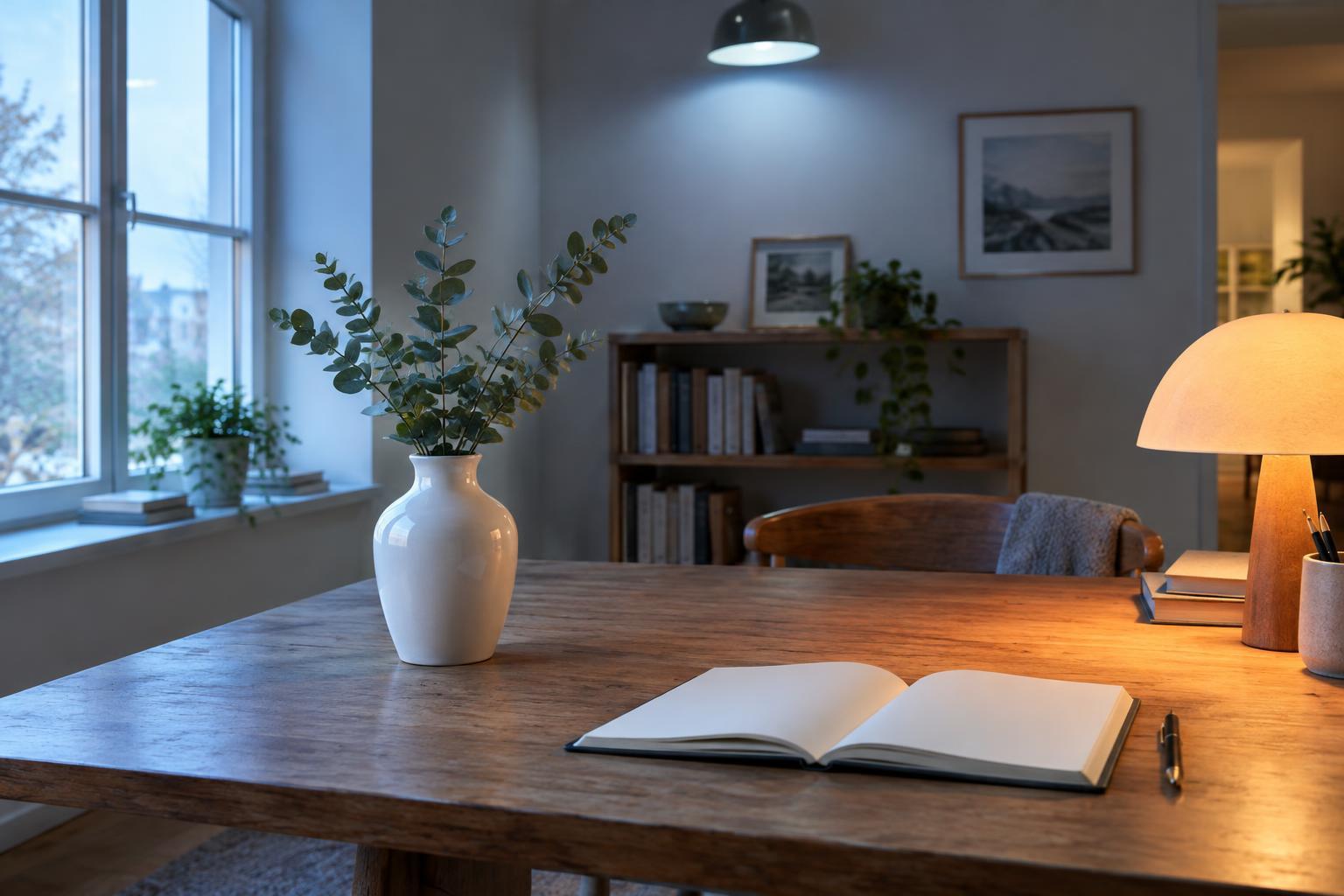
Why one scene can have several colors
Light sources do not all render a white surface the same way. Daylight entering a window may make it look relatively cool, while a nearby lamp makes it look warm. Some overhead or decorative lights can add a green or magenta tint. When these sources illuminate different parts of a photograph, the result is mixed lighting: one wall looks blue, a face looks orange, and a white shirt changes color across its folds.
Color temperature describes the warm-to-cool appearance of light and is commonly expressed in kelvin. It is useful, but it does not describe every color difference. A light can also have a green or magenta bias, and some artificial sources render colors unevenly. The practical question is not whether every surface is perfectly neutral. It is whether the color differences help describe the setting or pull attention away from the subject.
Decide what should look natural
Before adjusting the camera, identify the most important part of the frame. For a portrait, believable skin color may matter more than a neutral-looking wall. For an interior, the contrast between cool window light and warm lamps may be part of the atmosphere. Choose a visual priority rather than trying to make every light source look identical.
White balance tells the camera how to interpret the color of the light. Auto white balance is a useful starting point, but it may change between frames or favor the brightest area instead of the subject. A daylight, shade, or tungsten preset can make a series more consistent. If the camera allows it, a custom white balance based on a neutral reference in the subject’s light provides another starting point. None of these settings can fully neutralize two different lights falling on separate parts of the same scene.
Pay attention to where the light actually lands. A person standing between a window and a warm lamp may have differently colored light on each side of their face. Changing white balance shifts both sides together; it cannot make both neutral at once. Moving the person, changing the camera angle, or turning off a competing light may solve more than a menu adjustment.
Simplify the light before editing
Start by looking for a dominant source. If window light suits the subject, move them closer to the window and turn off nearby lamps when appropriate. If the room’s warm light is essential to the story, consider framing away from a large patch of cool daylight. Small changes in position can keep conflicting colors from crossing a face or another important surface.
You can also make sources more similar. For example, a suitable color-correction gel on an appropriate photographic light can bring its appearance closer to the ambient light. Use accessories designed for the specific fixture and follow its safety guidance; hot lamps and unsuitable materials are a hazardous combination. When you cannot control the lighting, you can still choose a composition that places each color in a distinct area rather than letting them overlap unpredictably.
Check the frame at shooting distance, not just the scene with your eyes. Our vision adapts readily to different illumination, so a color boundary that seems subtle in person may be obvious in a photograph. Review the image for tinted shadows, uneven skin color, and neutral objects that change hue across the frame. Take another frame after each meaningful adjustment so you can compare the results.
Edit color without flattening the scene
If your camera offers RAW capture, it generally gives you more flexibility to adjust white balance afterward than a finished JPEG. Begin with a global white-balance setting that makes the main subject convincing. A gray card or another reliably neutral reference photographed under the same light can help, but a white object is not automatically neutral, and a reference in one pool of light may not represent another.
Next, use restrained local adjustments for areas that remain distracting. A mask might reduce a strong blue cast on a face while leaving the cool window light visible behind it. Tint controls can help with green or magenta shifts that a warm-to-cool slider does not address. Check edges and transitions: an obvious correction boundary can be more distracting than the original cast.
Compare edited images within the same sequence. If similar scenes alternate between very warm and very cool renderings without a change in lighting or narrative purpose, the variation may interrupt the visual flow. Consistency does not require identical colors in every frame. It means making choices the viewer can understand.
Keep color in service of the story
Mixed light is not always a mistake. A warm desk lamp against a cool evening window can show how a space feels, while the colored glow of a sign can establish where a subject is standing. The aim is to avoid accidental casts that confuse the subject or make important details hard to read, not to remove every trace of the lighting that was present.
For documentary work, be especially careful about changes that substantially alter a scene’s apparent conditions. Prefer adjustments that clarify what the camera recorded over ones that invent a different atmosphere. A simple decision process helps: identify the subject, choose the light that should guide its color, reduce competing light when possible, and edit only what remains distracting. That approach preserves both visual clarity and the character of the place.