Why the same file can look different
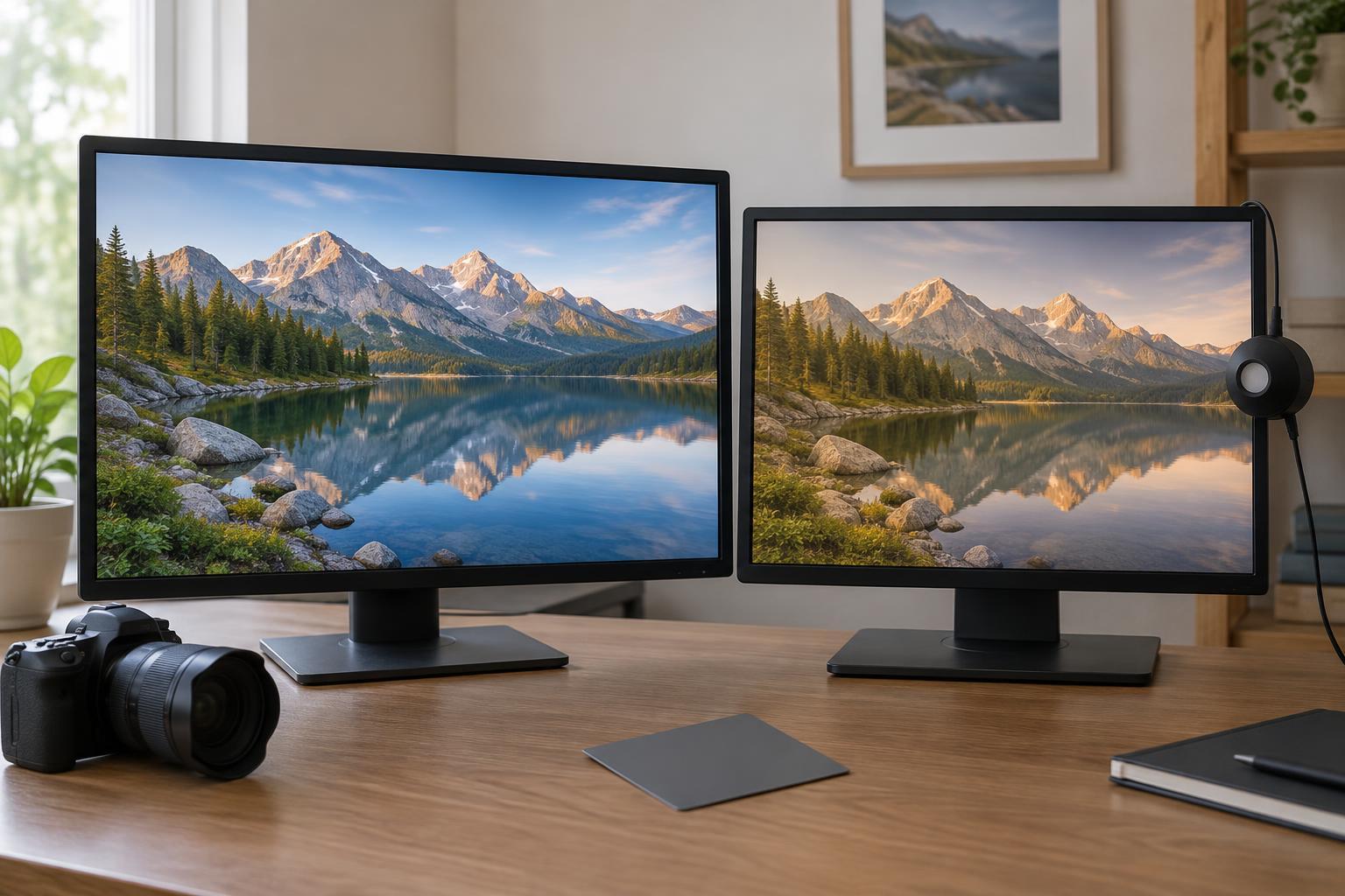
A digital photo does not have one guaranteed appearance. The file contains image values, but a screen must turn those values into light. Two displays may differ in brightness, contrast, color range, and the way they reproduce neutral grays. Their settings matter too: a vivid display mode can make colors appear stronger, while a warm display setting can shift whites toward yellow. Neither change requires the photo file itself to be different.
The room also affects your judgment. A screen can seem dim in bright daylight and uncomfortably bright at night. Colored walls or lamps may influence how you perceive whites and skin tones. This is why editing by eye on one screen, in one room, cannot ensure an identical result everywhere. The useful goal is consistency: make decisions in a stable viewing environment and prepare the file so other devices have the best chance of interpreting its colors as intended.
Calibration and profiling do different jobs
Calibration adjusts a display toward a chosen state. Depending on the monitor and setup, this may involve changing its brightness, selecting a display mode, or adjusting how it represents neutral tones. Profiling then describes the display’s measured color behavior in an ICC profile. Color-managed software can use that profile when sending an image to the screen. An ICC profile is therefore a description of a device or color space, not a filter that makes every screen look alike.
A display measurement device can help with both tasks by reading colors shown on the screen and guiding the setup. If you do not have one, you can still improve consistency: turn off automatic brightness changes and night-light modes while editing, choose a neutral display mode, and keep the room lighting reasonably steady. Visual adjustment is less dependable than measurement, particularly for subtle color casts, but a repeatable setup is better than changing settings from session to session.
Understand the profile attached to your photo
An image’s embedded color profile tells compatible software how to interpret its color values. The display profile serves a different purpose: it describes the monitor that will show the image. In a color-managed workflow, the application uses both pieces of information to translate image colors for that display. If an image has no embedded profile, software may have to assume what its values mean, and the result can vary.
For photos intended for general web viewing, exporting in sRGB with the sRGB profile embedded is a practical default. It gives color-managed software a clear interpretation and is a conservative choice for the wide range of screens people use. Converting to sRGB is not the same as merely attaching an sRGB label: conversion preserves the intended appearance as far as that color space allows, while relabeling changes how the existing numbers are interpreted. Check which action your editor’s export controls perform.
Build a dependable editing and export routine
Start by settling on a comfortable screen brightness before judging exposure. An excessively bright monitor can tempt you to make photos too dark; a dim one can push you in the opposite direction. Edit in a color-managed application, and use its histogram alongside your eyes when assessing tones. The histogram cannot tell you whether an image feels right, but it can help reveal clipped highlights or shadows that a particular display makes hard to notice.
When the edit is finished, export a test file using the settings you expect to publish. Open that exported file in your usual viewing software and, if possible, on another device. Look for broad problems—such as unexpectedly dark faces or harsh saturation—rather than trying to make every screen match pixel for pixel. Keep the original edit and export settings so you can diagnose a discrepancy without repeatedly changing the master image.
Know what calibration cannot fix
Calibration improves the reliability of your own decisions; it cannot control a viewer’s brightness setting, phone display mode, room lighting, or software. Some screens can show a wider range of colors than others, and some applications handle color profiles more consistently than others. HDR viewing can add another layer of variation when a device or application changes how it handles brightness. Differences across screens are normal, even when a file is prepared carefully.
If your work is also headed for print, treat it as a separate output check rather than assuming the screen preview is final. Paper, ink, and viewing light affect the result, and a printer-specific profile may allow a soft proof in your editing application. For everyday screen publishing, the most useful habits are simpler: stabilize your viewing conditions, use an appropriate display profile, embed the image profile on export, and check the finished file. Those steps will not guarantee a perfect match, but they make color decisions easier to explain and repeat.