Why a scene may need a size reference
A photograph can show shape, color, and texture while leaving size uncertain. A close view of a rock might resemble a mountain; an empty hall may feel smaller than it is. Without a reference, viewers often have to guess how large the subject is. Including an object whose size they roughly know gives them a way to interpret the rest of the frame.
A person is a common reference, but an empty chair, a doorway, a bicycle, or a hand can serve the same purpose. The goal is not to insert a recognizable object at any cost. It is to help the viewer answer a useful question: How large is the subject in relation to something familiar? If the scene already has clear cues, such as a row of standard-looking doors, another reference may only add clutter.
Choose a reference that belongs in the scene
Start with objects that are naturally present. A person walking along a path can clarify the height of trees; a bench can establish the proportions of a public space. In a close-up, a hand near a handmade object may communicate its size more clearly than a ruler, especially when the photograph is about how the object is used. A reference that fits the setting often feels less distracting than one placed there solely for comparison.
Familiar does not always mean fixed in size. People vary in height, and chairs, vehicles, and doors come in different dimensions. Such objects provide an approximate sense of scale, not a measurement. When exact dimensions matter, record them separately and state how they were obtained rather than asking the image to carry more precision than it can.
Place the reference where the comparison makes sense
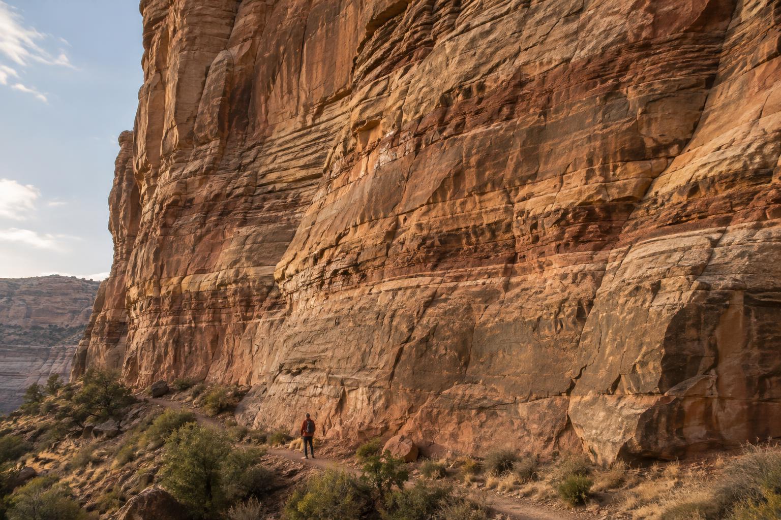
A size reference works best when its relationship to the subject is easy to read. If you want to show the height of a wall, a person standing near its base is more informative than a person much closer to the camera. Objects at different distances can appear similar in size even when they are not. Look for visible connections, such as shared ground, overlapping edges, or a clear path between the reference and the subject, that help viewers understand where each object sits.
Camera position matters as much as object choice. Shooting from a very low angle can make a nearby object loom over a distant one. A wide-angle lens used close to the reference can emphasize that difference; a longer focal length from farther away may make distances appear more compressed. Neither approach is inherently wrong, but each changes the impression of scale. Before taking the picture, check whether the size relationship still makes sense when you look at the whole frame.
Give the reference enough space to be recognized without letting it become the main subject by accident. If a figure is meant to show the breadth of a landscape, a readable silhouette may be enough. If the object is too small to identify, it cannot do its job; if it dominates the foreground, viewers may focus on it instead of the landscape.
Use light and composition to keep the cue visible
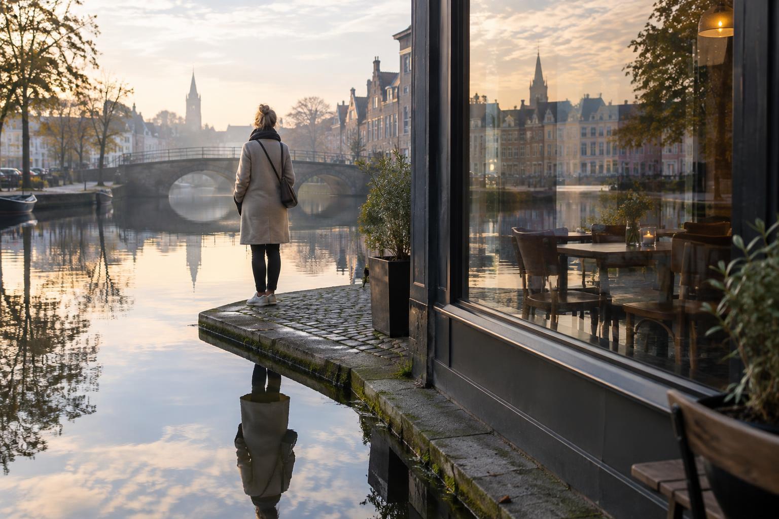
Contrast helps a scale cue survive a busy scene. A dark figure against a light wall can remain legible even when it occupies little of the frame. Against a similarly dark background, the same figure may disappear. A slight change in shooting position can separate overlapping shapes without changing the underlying scene. Pay attention to the edges of the reference: if a person’s outline merges with a tree trunk or doorway, the comparison becomes harder to read.
Also consider where the viewer’s eye travels. A path, railing, or line of repeated objects can lead from a familiar reference toward the main subject. Repetition can be especially useful: people spaced along a walkway, for example, can reveal depth as well as size. Keep enough surrounding space to show their relationship. A tight crop might create a stronger graphic image but remove the very context that makes scale understandable.
Keep the comparison honest
In documentary and educational photography, showing scale is also a matter of trust. Moving an object, directing a person, or selecting an extreme viewpoint can produce a striking comparison, but those choices may change what viewers believe about the scene. If the photograph is intended to describe an observed situation, favor a viewpoint that makes spatial relationships clear, and be transparent about any staging that matters to the image’s meaning.
When editing, avoid changes that alter the apparent relationship between the reference and the subject. Cropping, contrast, and brightness adjustments can improve clarity, but they can also remove distance cues or draw attention away from important surroundings. Ask a simple question before sharing the finished photograph: Could someone unfamiliar with this place reasonably tell what is near, what is far, and what the reference actually shows? A useful scale cue makes that interpretation easier, not merely more dramatic.