What a soft proof can tell you
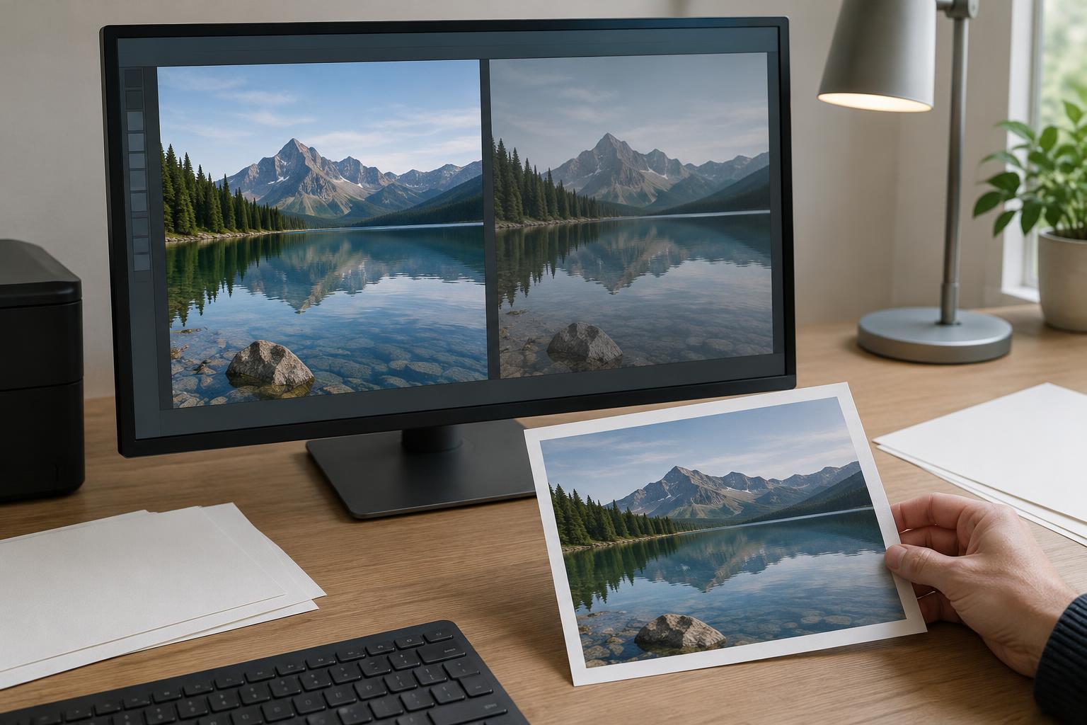
A bright screen and a sheet of paper produce images in different ways. A display emits light; a print reflects the light around it. Paper also has its own color and surface, and a printer cannot reproduce every color a display can show. As a result, a photograph that looks vivid on screen may appear darker, less saturated, or subtly different in color when printed.
Soft proofing is a screen-based preview of how an image may look through a particular printer, ink, and paper combination. It helps you spot likely problems before using paper and ink. It is a guide, not a promise: the accuracy of the preview depends on your display, the profile you choose, your print settings, and the light under which you view the finished print.
Start with a dependable viewing setup
Before judging small color differences, give your display a stable starting point. If you have access to a display-calibration device, use it to create a monitor profile and keep the display at a consistent brightness. A screen set very bright can encourage edits that produce disappointing, dark-looking prints. Without a calibrated display, soft proofing can still reveal broad changes, but subtle judgments about color will be less dependable.
Work in steady, neutral-looking room light when possible. Strongly colored light or reflections on the screen can change what you think you see. Later, examine your test print under reasonably consistent light as well. A print viewed beside a sunny window may look different from the same print under a warm household bulb; neither comparison is useful if the viewing conditions keep changing.
Choose the profile for the print you intend to make
In your editing application, enable its soft-proofing view and select the output profile for the printer and paper you plan to use. This ICC profile describes how that specific printing setup reproduces color. A profile for glossy paper is not a reliable stand-in for matte paper, even on the same printer. If you print through a lab, use a profile it provides for the relevant service when one is available, and follow its preparation instructions.
Check the other print settings, too. The paper type and quality setting in the printer driver should match the setup the profile was made for. Avoid having both the editing application and the printer driver independently manage color; choose one color-management path according to the printer or lab instructions. A correct profile paired with conflicting print settings will not give you a useful comparison.
Many applications let you compare rendering intents. Perceptual intent may compress a broader range of colors to preserve relationships between them, while relative colorimetric intent generally aims to preserve colors that fit within the destination range and adjust those that do not. The results depend on the profile and image, so compare the previews rather than assuming one intent is always better.
Read the preview, then edit for paper
Toggle between the original view and the soft proof. Look first at areas that carry the photograph’s meaning: faces, important shadows, pale highlights, and distinctive colors. If your software offers a paper-and-ink simulation, try it. The preview may look less punchy because paper is not a glowing display. That difference is not automatically a defect to correct.
Gamut warnings can point out colors the selected output cannot reproduce exactly, but they are prompts to inspect the image, not instructions to remove every warning. If a saturated color loses useful detail or shifts distractingly, try a modest adjustment to its saturation, hue, or brightness. If shadow detail disappears, a small lift in the relevant tones may help. Avoid forcing the print to imitate every aspect of the screen; heavy global corrections can damage parts of the photograph that already print well.
Keep these changes separate from your main edit. A virtual copy, snapshot, or print-specific version lets you tailor the image to one paper without altering the version prepared for screens or other printing surfaces. Name that version clearly so you can tell which profile and paper it was prepared for.
Confirm the proof with a small print
Make a test print using the profile and settings you chose for the proof. Let the print reach its normal appearance according to the paper and ink instructions, then view it under consistent light. Compare the result with your intention, not just with the luminous screen. Are the important details visible? Do skin tones or other familiar colors feel plausible? Does the image still direct attention where you want it?
If something is wrong, change one likely cause at a time. A print that is broadly too dark may point to display brightness or a tonal edit; an unexpected color cast may call for checking the profile and color-management settings before editing the image. Record the settings that worked. Soft proofing becomes most useful when the preview, the test print, and your notes form a repeatable workflow for the next photograph.