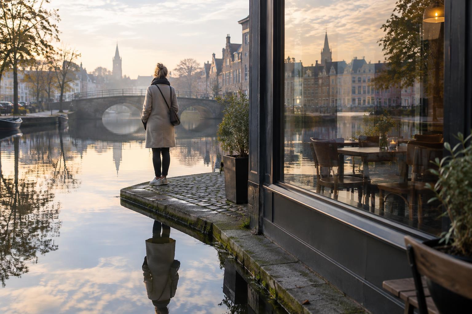
What a tone curve changes
A tone curve maps the brightness values in an image to new values. On a typical curve graph, darker input tones sit toward the left, brighter tones toward the right, and the vertical position shows how bright those tones become. The default diagonal leaves them largely unchanged. Move part of the line upward to brighten those tones; move it downward to darken them.
Unlike a single contrast slider, a curve lets you decide which tonal ranges change most. You can deepen midtone shadows while leaving the darkest areas nearly alone, or soften bright midtones without flattening the lightest highlights. This control is useful when an image needs more separation but still depends on detail in a dark coat, pale sky, or bright wall.
A curve does not recover detail that was never captured. If a region is recorded as featureless black or white, reshaping the curve cannot reveal texture there. The aim is to make the detail that exists easier to see while avoiding adjustments that hide it.
Read the image before moving the line
Start with the photograph, not a preferred curve shape. Identify the subject and the tones that help explain it. In a portrait, gentle transitions across a face may matter more than texture in a distant window. In a documentary frame, retaining information in both a person’s clothing and the surrounding space may be important to understanding the scene.
The histogram can help you locate the image’s tonal values, but it cannot tell you which details matter. A cluster near either edge deserves inspection, not an automatic correction. Look at the photograph at a size where you can judge its overall balance, then zoom in to check textures and transitions in important areas. If your editor offers clipping warnings, use them as a prompt to inspect those areas visually.
Make basic exposure and white-balance decisions before refining contrast. A curve can shift overall brightness, but trying to solve every tonal problem with one complicated line makes the edit harder to understand and revise.
Build contrast in the tones that need it
For a restrained increase in contrast, place one point in the darker midtones and move it slightly down, then place another in the brighter midtones and move it slightly up. This creates a gentle S shape. The steeper portion of the curve increases separation between nearby tones; a flatter portion reduces it. Small moves are usually easier to evaluate than a dramatic bend.
You do not have to anchor the curve at its exact endpoints, but pay attention to what happens there. Pulling the darkest output upward gives blacks a lighter appearance; pushing the lightest output downward dims whites. Either may suit the image, yet both reduce the available range at that end. Moving dark tones too far down or bright tones too far up can conceal texture, even when the overall image appears punchier.
If one range already has enough contrast, keep its part of the curve relatively steady. For example, you might increase separation in the midtones while gently restraining the upper highlights. Avoid placing many points close together unless you have a clear reason: sharp bends can create unnatural transitions or visible bands in smooth areas.
Protect detail and natural-looking color
After each meaningful move, inspect the areas you identified at the start. Look for dark textures merging into a single patch, bright surfaces turning featureless, or a smooth sky developing abrupt tonal steps. Compare the edit with the original at the same viewing size. A stronger impression is not always a clearer image; sometimes a slightly gentler curve preserves more of what the viewer needs to see.
A curve applied to the combined RGB channels can also affect how colors appear. If skin, foliage, or other familiar colors begin to look unnatural, reduce the adjustment or try a luminance-focused curve option if your editor provides one. Individual red, green, and blue channel curves are useful for deliberate color work, but they add another variable when the goal is simply to refine contrast.
When different parts of a frame need conflicting adjustments, a global curve may be the wrong tool on its own. A restrained local adjustment or mask can protect a bright background while shaping a darker subject. Keep the transition subtle enough that the edit does not call attention to the mask.
Finish with a repeatable check
Keep the curve editable where possible, such as in a non-destructive adjustment layer or your editor’s reversible raw workflow. Before exporting, toggle the curve off and on, check the full frame, and inspect important details at a closer view. Also consider the image at its likely viewing size: a small preview can hide both lost detail and overly strong contrast.
There is no universal curve that preserves every detail in every photograph. A useful edit directs attention while respecting the scene’s meaningful tonal information. Start with a clear purpose, make modest changes, and let the photograph—not the shape of the graph—decide when the contrast is enough.